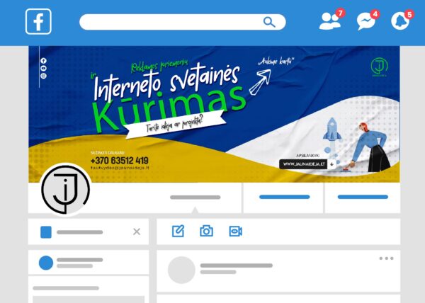
✅ Cover layout is a picture on Facebook profile. Unlike a profile photo, a cover photo there is a big banner, introducing visitors with a person or brand.
✅ Your cover is here the first thing anyone who logs in sees to your social network, so it should be immediately understandable, turėti aiškų ryšį su jumis ir nesukelti jokių klaidingų interpretacijų.
✅ For some, a Facebook cover photo is just the photo that adorns the top of your page. For others, it's a great way increase your brand awareness and spread the word about your company on the world's most used social network.
Cover layout for social networks is important because it is the first thing people see when they visit your profile. Here are some tips for creating a quality cover mockup for social media:
- Appropriate format and size: Different social networks have different cover sizes and requirements. Before creating a cover, check the requirements of your specific network.
- A clear topic or message: The cover should clearly convey the theme of your profile or content. It can be a visual element that represents your activity or a short message that describes your profile.
- Use of text: If you use text, make sure it's clear, legible, and doesn't add visual noise to the cover. The text should be short, informative and reflect your message.
- Testing and review: Before you publish your cover, make sure it looks good and meets your expectations. Check how it looks on different device resolutions.
Cover design – It's important to understand your audience and create content that will grab attention and communicate your uniqueness or important information. This is your calling card on social media, so be creative and pay attention to details.
Read more on our business blog LiJIA.


